
The live storefront gives collections room to lead, with fashion photography and product groupings doing the heavy lifting instead of dense interface copy.
Flagship Case Study · Fashion · eCommerce
Hanaka Classic
A clean fashion storefront for Hanaka Classic, built around simple browsing, collections, and product-led storytelling.
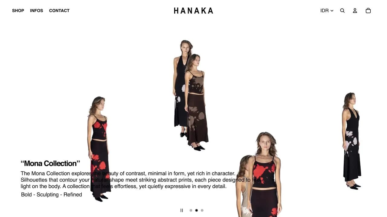
Live capture from hanakaclassic.com showing the Hanaka Classic fashion storefront.
Evidence checked08 Aug 2026Public surfaces and captured project material only. No unapproved performance claims.
Live Surface Details
Navigation, product browsing, search, and cart access stay simple so customers can move from campaign imagery into shopping without friction.
The minimal white-space direction supports a classic fashion tone, keeping attention on fabric, styling, and collection names.
Proof & Business Context
The case study is backed by live reference surfaces or captured public material from hanakaclassic.com.
The engagement focused on the visible scope shown here, connecting website, ecommerce, brand system, ui/ux into one coherent delivery.
The site gives Hanaka Classic a clearer online retail presence and a stronger base for collection launches.
Private analytics, revenue, conversion, and retention numbers are not claimed publicly unless the client has approved them. This page uses live delivery proof, product structure, and observable project evidence.
Contribution & Evidence
What Xyncema handled, and what can be checked.
The case study covers Xyncema's website, commerce, interface, and brand-system contribution. Current products, campaigns, inventory, pricing, retail operations, and editorial publishing remain Hanaka Classic's ongoing business activity.
- Storefront information architecture
- Collection and product presentation
- Commerce utility and responsive UI
- Campaign-ready content structure
- Let collection and product photography lead without weakening commerce utility.
- Support regional browsing, currency context, account, search, cart, and campaign drops.
- Keep the interface durable across changing inventory and seasonal launches.
Evidence ledger2 reviewed sources
Live commerce surface
The current storefront exposes region and currency controls, account, search, cart, shop navigation, and live product listings.
hanakaclassic.com Open sourceChecked 08 Aug 2026
Brand and editorial continuity
The public site connects new arrivals and product categories with articles, collaborations, stockist information, and lookbook content.
Hanaka Classic storefront Open sourceChecked 08 Aug 2026
Challenge
Hanaka Classic needed a more credible digital storefront that could show collections clearly while keeping the brand simple and accessible.
Objectives
- Create a calmer storefront experience for browsing collections.
- Give the brand a more consistent product presentation.
- Support product discovery, cart behavior, and repeat campaign drops.
Strategy
We kept the commerce journey simple and allowed product photography, collection naming, and direct navigation to carry the buying flow.
Design Direction
White space, product-first layouts, minimal navigation, restrained typography, and clear collection moments.
Development / Technical Execution
Responsive storefront structure, product and collection templates, commerce navigation, search/cart access, and campaign-ready homepage slots.
Results / Impact
The site gives Hanaka Classic a clearer online retail presence and a stronger base for collection launches.
Observable, not invented
Outcomes supported by public evidence.
These outcomes describe visible delivery and product behavior. Revenue, conversion, retention, and satisfaction figures remain unpublished until the client approves them.
Product discovery, regional settings, account, cart, and search are available on the public production website.
Evidence: Live commerce surfaceCollections and new arrivals can coexist with collaboration stories and brand activity without becoming separate web experiences.
Evidence: Brand and editorial continuityFashionCategory
StorefrontSurface
2019Domain Since
Related Work
More connected systems.
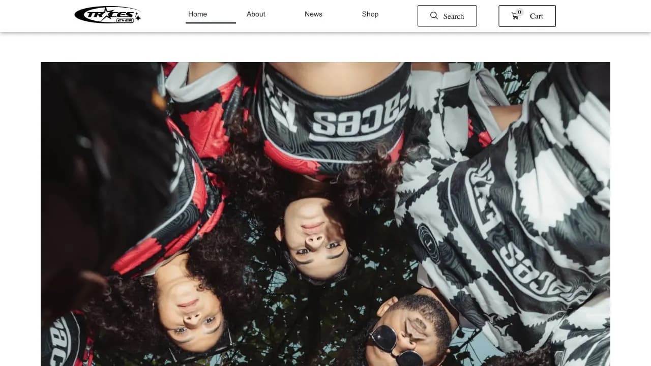
Traces Ever
A high-contrast streetwear storefront with bold product visuals and direct shopping navigation.
Fashion · Streetwear · eCommerce / 2024
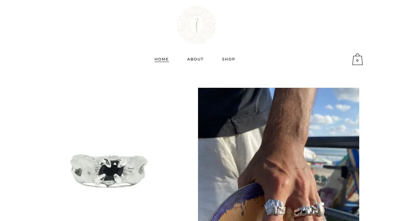
Shepherd Jewelry
A minimal jewelry storefront that lets product photography and collection detail lead the experience.
Jewelry · Fashion · eCommerce / 2024
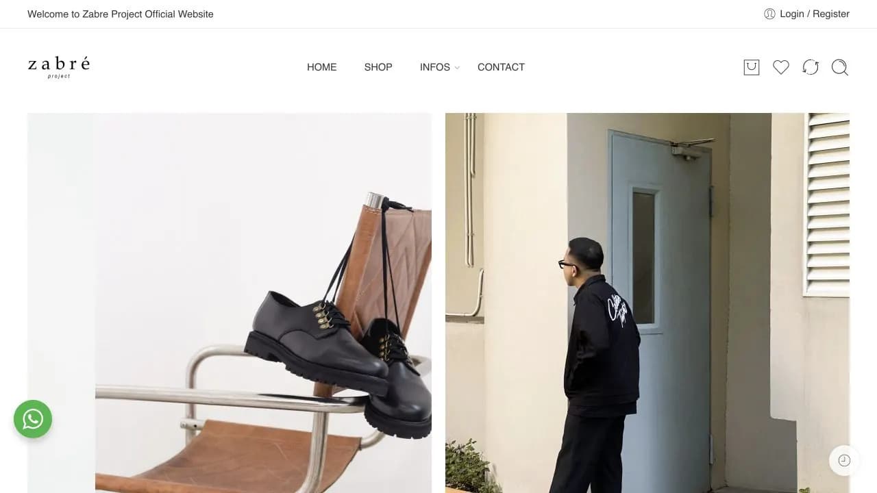
Zabre Project
A footwear commerce website for shoes, loafers, sandals, and product collections.
Fashion · Footwear · eCommerce / 2023